Help on Using the Map
Menu
This menu changes what the visualization will show.
”Laureates” will show information about persons who were nominated for the Nobel Prize and later became Nobel Laureates. Note that this is naturally far from all Nobel Laureates, since the nominations are kept secret for 50 years.
”Nominees” will show data about persons who were nominated for the Nobel Prize.
”Nominators” will show information about persons who have nominated other persons for the Nobel Prize.
Category
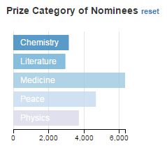
This graph displays all persons belonging to each Nobel Prize category. Click on a category to filter and display data about only these persons.
Gender
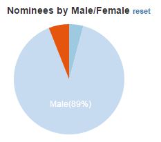
This graph display the number of persons depending on gender. "Unknown" means that this information is not available for the person. Click on a gender to filter and display data about only this gender.
Timeline
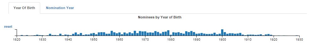
You can select between two timelines, one that displays the year of birth for the persons and one for the year of the nomination. The graph indicates the number of persons. Click and drag to select a range of years to filter and display about persons connected to these years only.
Map
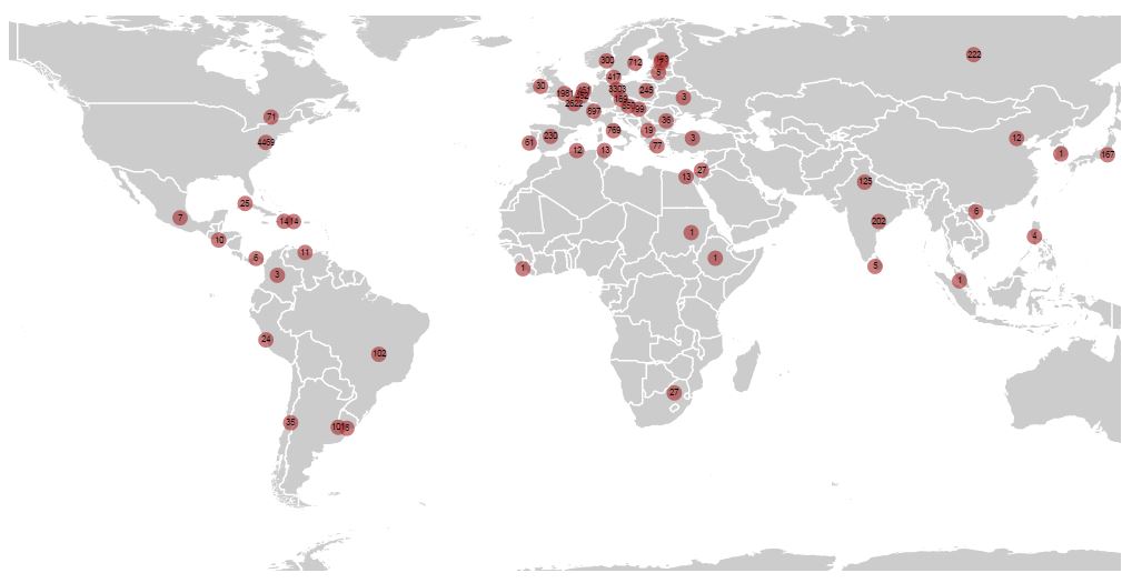
The map shows number of persons working in different countries at the time of the nomination. Click and drag to pan in the map. Use the scroll wheel to zoom in and out in the map.
Headline
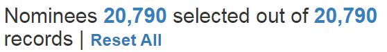
The headline displays how many persons that are currently in the dataset and how many that are within the filters you have currently selected. The ”reset all” option resets all filters to include the complete dataset.